


The problem
Migro.ro was an established tax recovery service with room to grow. The redesign needed to improve the client experience and turn more website visits into leads, including for people who were less comfortable using digital services.
The brief called for an experience that would:
Seen
Clients needed to upload documents over time and keep track of their tax recovery files. This often meant repeated phone calls. A client portal could bring documents, requests and status updates into one place.


- Orange#FF7043
- Charcoal#2C3E50
- White#FFFFFF
- Turquoise#4FD1C5
- Grey#EAEAEA
My role
I led the project, provided Migro with an identity refresh and a new digital experience that shaped the overall user experience and visual design.
My responsibilities included:

Researching the market and competitors using AI tools to identify opportunities and useful approaches.

Analyzing Microsoft Clarity and Google Suite data to understand behavior on the existing website.

Interviewing users and empathizing with their needs and pain points.

Creating prototypes required for testing the new website.

Working with stakeholders and developers to carry the design into the final product.








Solution design & approach
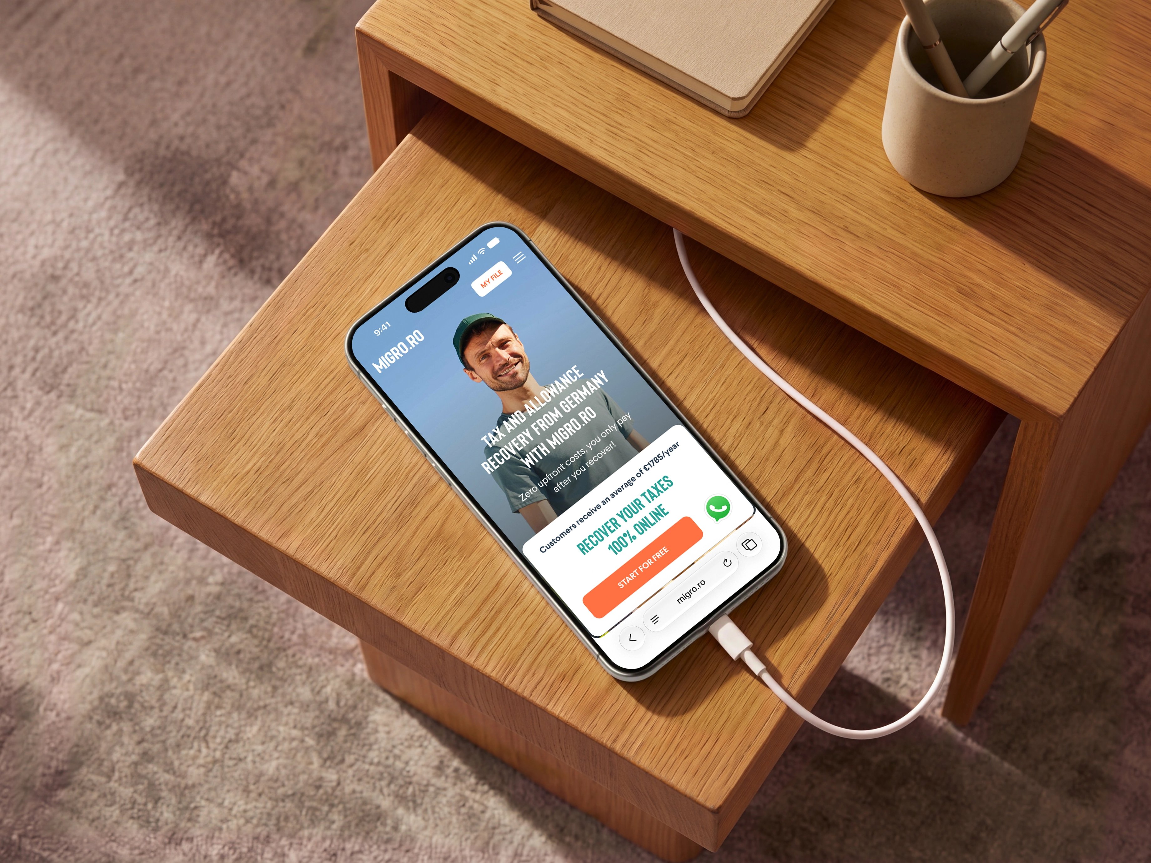
I used research findings and stakeholder goals to simplify the website, make the service feel more approachable, and give clients a clearer way to start and manage their tax recovery process.
Clear information architecture
I reorganized complex tax recovery information into a structure that was easier to understand. The new layout guides visitors through the service and helps them find their next step.
An easier start on mobile
I placed a fixed call-to-action button within easy thumb reach on mobile. Visitors can start the process without having to scroll back to find the next step.
A client portal for ongoing requests
I designed a client portal where customers can check their file status, update their information and upload documents. Migro can request or provide files and additional information in the same place, bringing the ongoing exchange into a clearer workflow.


Identity Refresh
I refreshed Migro’s identity and created a manual to guide its use across future platforms. The work covered the logo, color palette, illustrated character and supporting trust elements.
A more compact logo
I refined the logo into a more compact, professional mark that better suited Migro’s digital presence.
A more distinctive palette
I introduced turquoise to give the identity a stronger point of recognition, supported by orange and neutral colors.
Visible reassurance
Research highlighted the value of trust signals. I designed a “100% Satisfaction Guaranteed” badge to make the reassurance visible within the experience.


Results and Impact
The redesigned identity & website increased lead conversion rate by 45% following A/B testing.
More visibility for clients
The portal lets clients check file status, update details and provide documents in one place.
A consistent brand foundation
The refreshed identity and manual provide guidelines for future applications of the brand.
A clearer digital experience
The refreshed identity, website and client portal bring Migro’s services into a consistent experience.